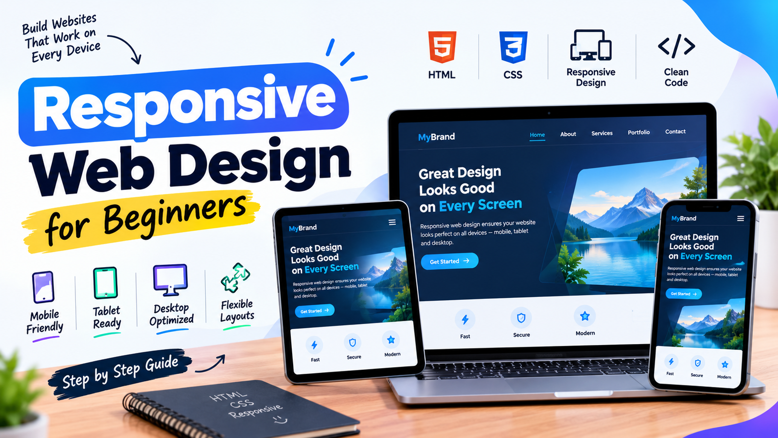
A responsive website adapts to mobile, tablet and desktop screens. Learn how flexible layouts, CSS media queries and responsive images improve the experience on different devices.
FILED UNDER


A responsive website adapts to mobile, tablet and desktop screens. Learn how flexible layouts, CSS media queries and responsive images improve the experience on different devices.

Explore modern web development practices, responsive layouts, performance, accessibility and the tools used to build reliable websites.
Read Article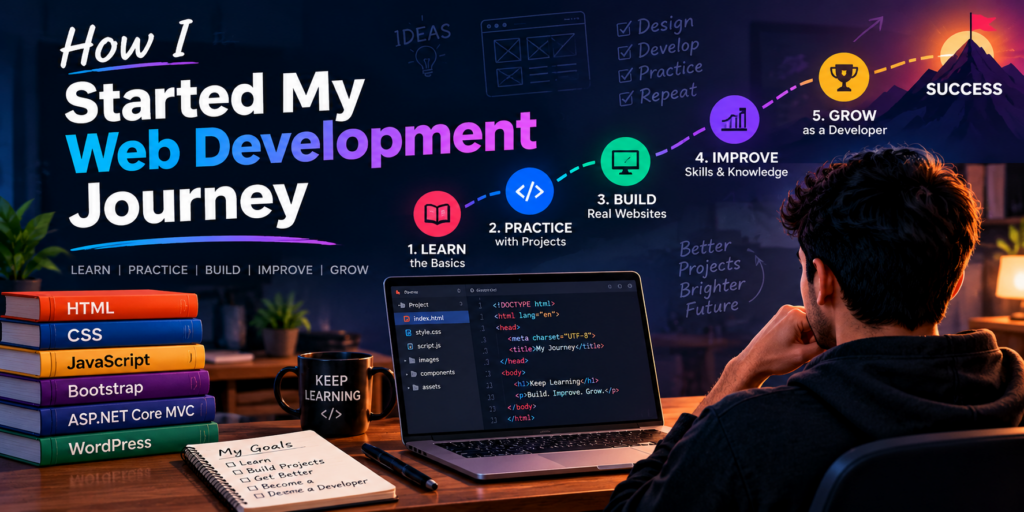
Discover my journey into web development, the skills I am learning, and how I build modern websites using HTML, CSS, JavaScript and...
Read Article
Leave a Comment
Have a question or a different perspective? Share it respectfully below.